Portfolio

You can follow me on Pinterest, where I also post my own sketches and renderings:
https://pin.it/3HDsOJ5

Please check out my Design Portfolio and feel free to contact me or leave a comment!
Contact: Simon_larsson_92@hotmail.com
Portfolio Link:
https://1drv.ms/b/s!AtncJIXbeOQ-ondjx5FHa_Y4mVhk

Total Pageviews

Follow on Blogger

Search

Car Sketch - BMW SUV

Taking the opportunity to do some sketching in the free days inbetween Christmas and New Year. Always relaxing to grab a pen and paper and just sketch whatever comes to mind. In an ideal world I would love to do this much more often and to start experimenting and go crazy a little bit more and just see what my intuition can come up with.

Edited with Liquify tool in Photoshop

Original

Widala Garbage Bin & Coal Bin

This is a presentation image for a project that I was working with together with a colleague some time ago at ÅF Design (at the time, nowadays Inuse). It's fun now when I have been working for a while and more and more real projects starts going public, which means I'm finally allowed to show some of the work I'm doing. For more information about the project, check out the Case presentation Inuse homepage: https://www.inuse.se/case/produktdesign-i-offentlig-miljo/

I have taken the picture with my Nikon 3200 D Camera outside Trädgårdsföreningen in Gothenburg, looking towards Kungsportsplatsen which is just a couple of hundred meters from the Inuse office. The photo has since been heavily edited in Photoshop to remove details, tweak the colors, add objects and make it a bit more "artsy". The intention was to make it feel more like a concept vision, showing what the Garbage/Coal Bins can look like in it's right context, together with Widala's BBQ Grill for public spaces. In it's final stage the image probably turned out to be 50% photo and 50% collage, considering that almost all the objects in the foreground are added afterwards. The CAD renderings of the Garbage Bins and the BBQ Grill are rendered in Keyshot and the Bins are built in the 3D Industrial Design CAD software Rhino (Rhinocerous 5).

Widala Case Presentation


Original Photo

Rendering from Keyshot (originally transparent background)

KIA Concept Sketch

This is a concept sketch of some sort of sporty Kia model. I really liked the feeling in the original sketch, where I was just playing around with markers, starting with a bright one, and then going darker and darker, but it had some perspective problems. So I've had it laying around for a while, until I took the time to experiment with the perspective. Because the wheels already had quite different angles, indicating that the car is seen through some sort of fisheye lens, I choose to make the perspective more apparent, meaning that the closer part of the car becomes bigger and the part further away becomes smaller. Also the original sketch had a sort of backwards tilting, which I tried to correct.

When making the original sketch I imagined that it would be a quite small, sporty, SUV inspired car, so in the correction process, using the tool Liquify in Photoshop, I also made the whole car feel a bit smaller, to become closer to my original vision. Sketching is only a tool to concretize ones imagination and to find new ideas, so if the end result is close to what you had in mind, it doesn't really matter what your process looked like to get you there, even it could feel like cheating. In the end Photoshop is also a sketch tool, just like paper and pen is. One thing that does matters is time consumtion and because of that it is always good to keep on improving your sketching skills until you find the fastest way to work, where you don't need to correct the perspective of every sketch, which can often be quite time consuming.

Corrected Sketch (using Liquify tool in Photoshop)


Original Sketch

Gokart Event Picture

I'm hosting a small gokart event (of around 10 people) together with two friends and yesterday it was time to create a Facebook event for the race. Of course I felt we needed a proper event poster, so I spent unreasonable much time yesterday evening to put together an extremely over worked racing infused image with the theme "Extra Everything" at the expense of less is more thinking, inspired by the name of the race preset that we choose from the gokart place's (Göteborgs Gokartcenter) offers - "Maxi Race". I used some pictures that we took some years ago when we had a similar event + some gokart/F1/racing related images from google and some other images. To quote the guitar virtuoso from Sweden (originally), Yngwie Malmsteen, who is world famous for being a pioneer in playing super fast guitar solos: In this case I choose to go with the mindset "More is more". Sometimes I just feel that is much more fun even if the end result often just becomes a mess! :)

"People kept on telling me to slow down, you know, they said "hey slow down, remember less is more" I always said "How can that be? How can less be more, it's impossible! More is more!"
/Yngwie Malmsteen


Time: 3-4 hours

The image consist of the following images + some good old Photoshop Magic:


(Me in the top right corner)


Sketching in Porto Old Town/Castle Area, Portugal

This is a sketch from a vacation in Portugal. When you are backpacking with two other designers, how can you avoid to have a sketch session in the beautiful Old town/castle area in Porto, Portugal's 2nd largest city?

Drawing Game - After Work Activity

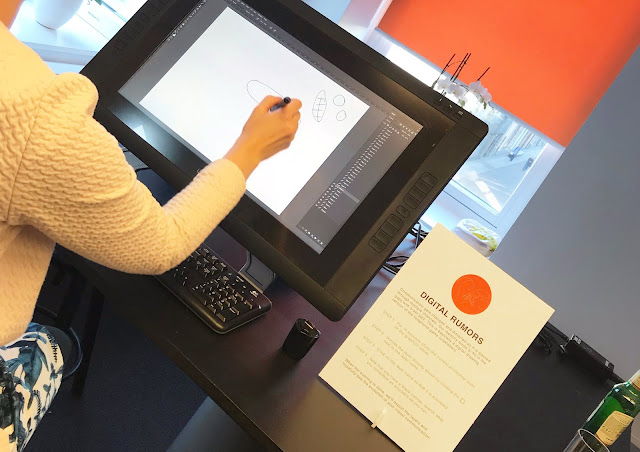
Last week me and a colleague got the task to prepare some fun games and activities for the Summer Party after work that we had at the office. One of the things we did was this game, which we called "Digital Rumors". It meant that we prepared a Wacom Cintiq screen and a Photoshop document with different white layers. Then we choose a picture that the first participant should look at for 10 seconds before he or she unhides the first white layer and starts drawing the picture again from memory. Then the next person looks 10 seconds at the previous person's sketch, before he or she unhides the next white layers and tries to draw the previous image from memory. This means that the image very quickly gets distorted and in our case the "animal" even changes kind multiple times and at one point even changes direction. The activity turned out to be very successful and appreciated, but I think we had a bit too high expectations on our participants when choosing picture...


To see the result of the game, check out the GIF below. The pictures are presented last drawing first and the original last:


IHL - Inuse [Table] Hockey League


We have a table hockey game at the office and having a 5 min game, or sometimes two, is a good way to reset the energy and the focus in the afternoon when productivity starts to go down. Now and then me and some colleagues arrange small tournaments or afterworks, or even join bigger competitions like the international table hockey competition Swedish Masters. I decided to design a logo/picture for these internal events. IHL means Inuse Hockey Leauge, Inuse (part of ÅF) being the user experience design company that I work for. The image is a montage of 3 images that I found on Google: One of table hockey players, one of a real Finnish hockey goalie and one with a goalie looking straight into the camera. Then I played around a bit, making the image look more painted, by smudging out the edges. I think the result became really nice and it actually turned out to be a good Photoshop exercise.


Future Container Handler Concept Sketches

Here are some sketches from a project that I do when I have time between assignments at work. However, lately I have not had much time to work on it, because since we (ÅF Design) moved together with the UX/Service design company Inuse in the beginning of this year there is always something to fix in the office, like unpacking, setting up the workshop, putting together reference cases for our shared work in progress online project portfolio a.s.o. However, when everything is done I believe we at Inuse will be one of the strongest players within the design world in Sweden and be able to cover almost all major areas of design because of our good mix of competences.

Model Making Course - Computer Mouse

Recently I found some PU (Polyurethane) foam models from my time at the BA Programme in Industrial Design, Umeå Institute of Design. This was one of our first courses where we learned to use the school's amazing workshop and in this particular part of the course the objective was to learn how to work with PU foam and also to get a taste of how it can be to sketch in 3D. First I did some sketch models made from one of the softer versions of PU foam and then I choose my favorite and made a final version in a harder foam, which I also painted to more or less resemble what the final look could be.

Toilet Art - Tesla in Space

In the main toilet of the designstudio we have created a culture where people paint and write things on the walls, which is quite nice and can give you an extra smile during the day when you see something new up there. The other day I saw that someone had added a rocket booster to a house made by someone else, so since Elon Musk launched his Falcon Heavy rocket, carrying his private car into space not too long ago, I couldn't resist adding a Tesla on the top of the "rocket-house".


Equipment: Thick White Ink Pen
Time: 5 min


Me on the Inside

This is a sketch to illustrate my personality when it comes to food. I might not look like this in reality, but underneath the surface it's not too far off. I sketched it on a post-it patch and originally put it on a colleague's empty food box together with another post-it saying "Thx!" after she asked me if I wanted to eat it, since she had forgotten it in the work fridge. But then I kind of fell in love with this overweight version of me and now I keep him taped to my desktop lamp at my workplace.


Equipment: Blue Ballpoint pen, a Black felt pen and a post-it patch
Time: 10 min


Mclaren F1 Livery concept

Here is my suggestion for how I think the 2018 Mclaren F1 livery could be much improved with very small changes:


The orange livery has great potential and looks great already in some angles, but the design is inhibited by mainly one design flaw, in my oppinion: The blue should only be an accent color and I think it has been overdone in the present design. The similar Indy 500 livery on the other hand (see below) was excellent because of its super clean approach and really stood out from the rest of the field. As you can see the blue in that case was kept only to parts of the wings and the numbers while the orange was allowed to really dominate the main body, including the fin, which I think is the way to go with the F1 livery as well. With more, preferably black, graphical elements on the car it will look even better, for examples when there are more logos added to the car. Making the fin entirely orange would also makes the car look more aggressive because the appearance of the main body becomes more edgy and less round. My oppinion is that the combination of the round shape and the big blue and orange fields makes the present design almost look a bit childish. To further improve the livery the black parts could be made matte instead of glossy and possibly the halo could be orange, or partly orange. 

2017 Indy 500 Livery